Last Update 24-Jun-2020, Kim Tolbert
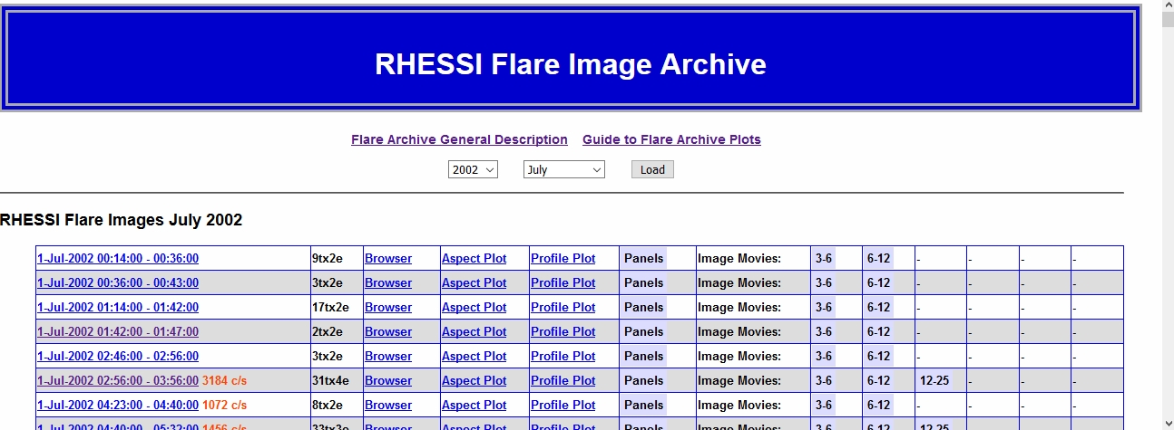
Images and related products were generated for >75,000 RHESSI flares using the procedures described in RHESSI Image Archive Strategy. Quick access to the flare images is provided through the RHESSI Flare Image Archive monthly listings. Select a year and month via the pulldown options, and click "Load" to see a line-per-flare listing with links to the full web page for that flare, as well as direct links for a quick look at various plots. The figure below shows the beginning of the list for July 2002.
Some things to note regarding the list:
Each type of plot included in the image archive is described below. We used the flare of 20-Aug-2002 08:21 - 08:36 (flare number 20820140) as an example.
Aspect Solution Plots
Time Profile Plots
Image Panel Display
Images
Visibility Comparison Plots
Profile Comparison Plots
 Each single-flare web page shows some general information about the flare (start,peak,end time, peak rate, and more from the flare catalog) and two plots - the aspect solution plot during the full flare interval and GOES and RHESSI time profile plots showing the time/energy binning selected for this flare. To the right of these plots are a number of links to
Below this general area, for each image reconstruction algorithm - Back Projection, Clean, Clean_59, MEM_GE, VIS_CS, and VIS_FWDFIT - the images, image movies, and other plots generated are displayed or links are provided.
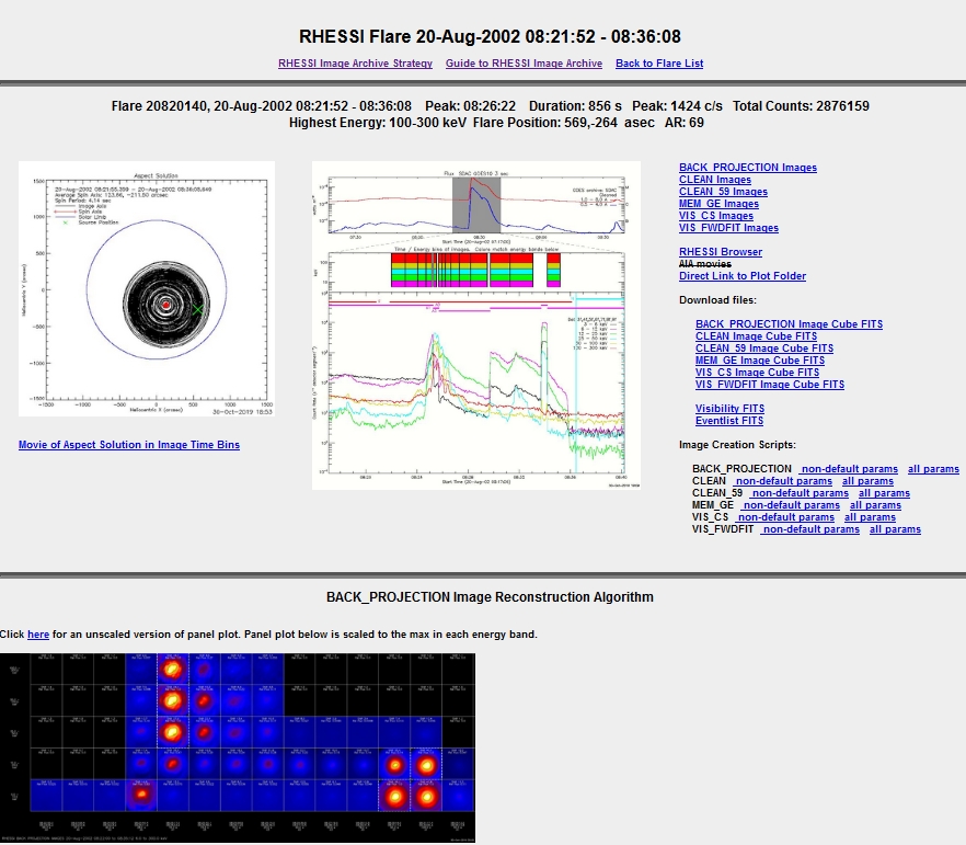
Aspect Solution Plots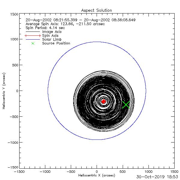
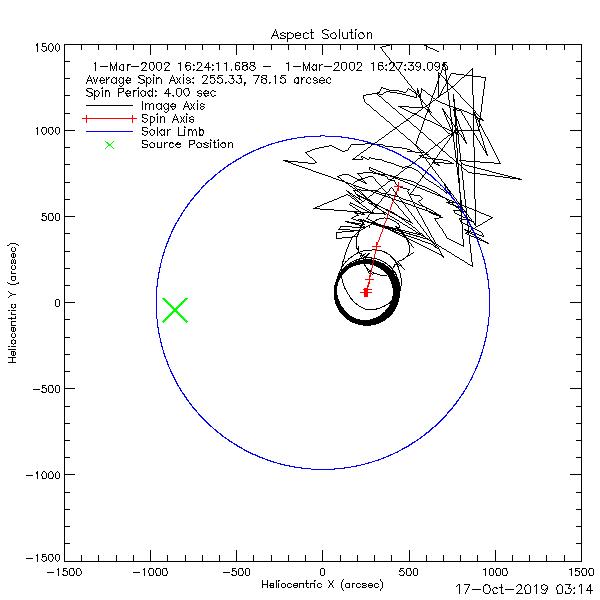
The aspect solution plot shows the location of the source (green X), the imaging axis (black), and the spin axis (red +) on the solar disk (solar limb shown in dark blue) during the full flare time interval. Movies showing the aspect solution during each image time bin are available through the 'Movie of Aspect Solution in Image Time Bins' link. Each black circle represents one rotation of the spacecraft (4 seconds). The diameter of the image axis indicates the amount of wobble in the rotation. The amount of wobble varies for a number of reasons, the two main ones being contraction/expansion with changes in temperature from the day/night cycle and changes in the attenuators (the physical motion of moving the attenuator 'bumps' the spacecraft ???). The spin axis shown is simply the center of each 4s rotation. The spin axis moves frequently because the on-board magnetic torquers are constantly trying to keep the spin axis in approximately the same location on the solar disk (near the center in the southwest quadrant) as well as trying to keep the spin rate at ~15 rpm.
Because RHESSI image reconstruction relies on modulation by the grids, it is nearly impossible to image a source that is very near the spin axis when the image axis circles are small. In cases where the source lies on the image axis circle, but the circle is large, there may be enough modulation from parts of the rotation to make an image.??? |
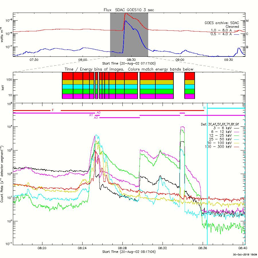
Time Profile Plots
|
Image Panel DisplayFor each algorithm, all of the images that were generated are displayed in a grid of time (horizontal) and energy (vertical) bins. Some of the cells may be blank if the signal-to-noise (SNR) ratio was too low in that time/energy bin. The SNR thresholds were determined empirically with the goal of producing only scientifically meaningful images (unfortunately some nonsense images are still made). The threshold is 4.0 for MEM_GE, and 2.0 for the other algorithms. There are two panel display plots:
Here (and similarly in the flare image web page), clicking the plot opens the plot file, and clicking again in the plot enlarges the plot, centered on the location you clicked, with a scroll bar along the bottom if needed. The example shown here is for the CLEAN algorithm. 

|
ImagesFor each image reconstruction algorithm, the image frame at the peak time interval for each energy band that could be imaged is displayed and can be enlarged by clicking the image. Below the image is a figure showing the corresponding visiblity comparison plot. Above each image are links for:
For some flares, the left-most column will contain an image and link for a movie of the low-energy images overlaid by contours at 50,70,90% of the high-energy images. These are available when images were made for more than one energy band and there is a high-energy band at 12-25 keV or above with an SNR value of at least 5. 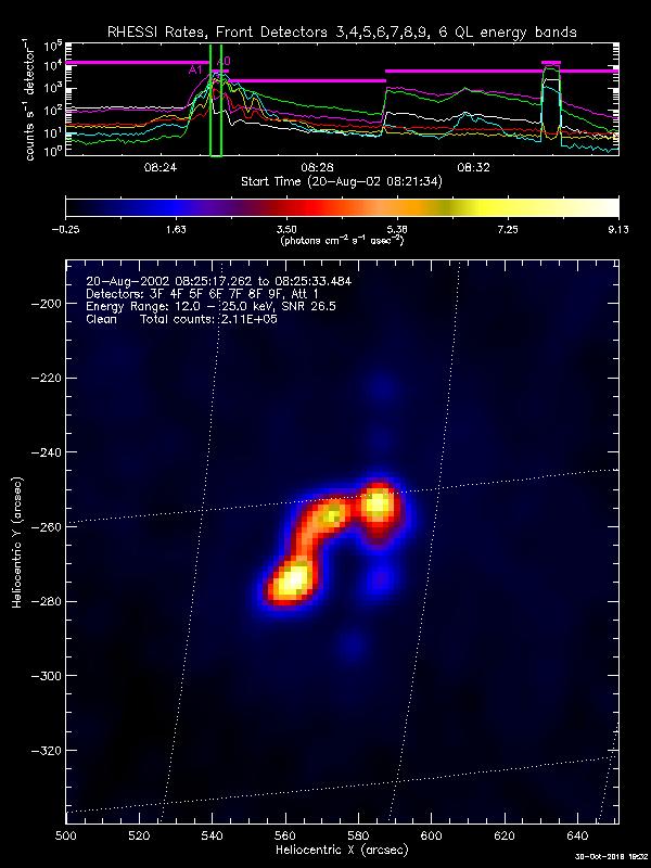
Each movie frame (an example of the 12-25 keV CLEAN image at peak time is on the left) shows the following:
|
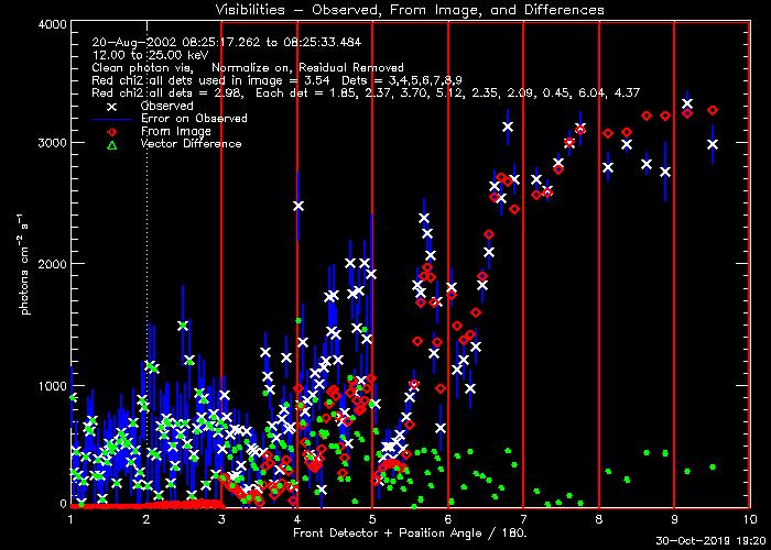
Visibility Comparison Plots
The legend includes the time/energy/algorithm used and the reduced chi-square values computed from the measured and predicted visibility vectors weighted by the statistical uncertainties for
The closer the predicted amplitudes are to the observed, quantified by the chi-square value, the more reliable the image. In this example, Detectors 5,6, and 7 are well matched, while ...????? Brian? |
Profile Comparison Plots
The plots show the count rate profiles as a function of regularized roll angle (spacecraft roll angle corrected for the offset between the spin axis and the mean subcollimator optical axis) for each detector used to make the image, with the measured profile in red and the profile predicted by the image in white. The count rates are summed modulo the spacecraft spin period (~4 s) for the time interval used for the image (known as phase stacking). The agreement between the measured and predicted rates is an indication of how well the reconstructed image matches the data. This agreement is quantified with the Cash or C-statistic, given as a separate value for each detector and as an overall value for all detectors together. More discussion ????? Brian? |