Click here to see the entire HESSI GUI Guide
Click here to see the HESSI Spectrum Widget Documentation
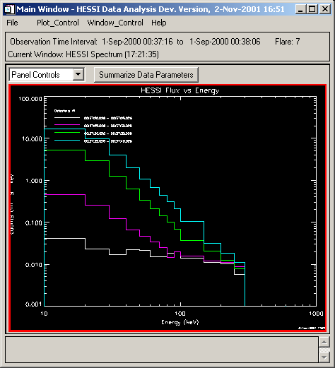
These are snapshots of the two types of plots produced by the HESSI Spectrum Widget. The top snapshot shows the spectrum for simulated Flare 7 over 4 5-second time intervals, with white, purple, green, cyan showing the progression from the start to the peak of the flare. The bottom snapshot shows a time history plot of ~50 seconds over the peak of Flare 7, using 2-second bins with white, purple, green, cyan, and yellow showing the 10-keV energy bins from 10 to 60 keV. In both cases, the XY Plot Display Options widget under the Plot_Control pulldown menu was used to show the times and energies separately, instead of summing them (the default).

Last updated 02 November, 2001 by Kim Tolbert, 301-286-3965